Less bias, better transfer?
A general-purpose AI, trained only on everyday photos, has never seen a medical image — yet it reads a brain CT surprisingly well. So the real question is what actually makes that work. The answer wasn't what I bet on.
An illustrative demonstration on public, imperfect data (RSNA-ICH 2019). This shows what the method can do — it is not a clinical tool and makes no clinical or regulatory (MDR) claim.
First, the basics: how these AIs learn to see
Everything below rests on three ideas: how a model learns without labels, how much human assumption each learning style bakes in (its inductive bias), and the frozen-encoder test setup. The three-minute version — watch it, or read it here.
In depth: the setup, CT windowing, and the three teaching styles
The test, in plain words: the artist and the medical student
Picture the AI as an artist with an extraordinary eye, who has studied millions of pictures — cats, cars, landscapes. We don't ask him to diagnose. We hand him a brain scan and give one instruction: “write down everything you notice — every edge, texture, bright patch, asymmetry — in your own shorthand.” He doesn't know what a bleed is; he just describes what's there, the same careful way every time. Those notes are his reading of the scan.
Then a first-year medical student steps in who never sees the scan — she reads only the artist's notes. From a pile of past cases (the notes plus the known answer) she learns which jottings tend to go with “bleed.” That's the only thing we train, and it takes minutes. So the real test is: how good are the artist's notes? And because we never re-teach the artist (he stays frozen), the comparison between artists is fair, and the student needs only a handful of examples to learn.
| Ingredient | Choice |
|---|---|
| Data | RSNA brain-CT (2019, public) — ~752,000 slices, 21,744 patients |
| Slices used | ~187,000 — about a quarter of the dataset (a sample, not the full set) |
| Question | Is there a brain bleed (hemorrhage)? — plus the 6-label competition score |
| Pre-processing | 3 clinical “brightness windows” (brain / subdural / bone), each as its own grayscale image |
| The AI models | Frozen — DINOv2, DINOv3, I-JEPA, ResNet, ConvNeXt — plus two “outsiders”: a vision-language model (Qwen) and a document encoder (Donut) |
| What we train | A logistic regression per window on the frozen “notes” — then average the three |
| Fairness | Split by patient (no leakage), fixed random seed |
What a “window” actually is — try it yourself
A CT scan doesn't store brightness; it stores density in Hounsfield Units (HU), from air (−1000) to dense bone (+2000 and beyond). A screen can't show 4,000 shades at once, so you pick a window — a slice of the HU scale stretched to full black-to-white contrast. The catch: gray matter, white matter and fresh blood — the entire question in a head CT — sit within a ~70-HU sliver of that 4,000-HU scale. Move the window below and watch what appears and disappears:
Schematic phantom, not a patient scan (the dataset licence forbids patient images). The brightness of every region is the real windowing transform — screen value = (HU − window-low) / width — applied to real tissue densities. The window (orange band on the scale) is the sliver of the 4,000-HU range stretched to full black-to-white; everything below it turns black, everything above turns white. Picking where to place it is a human choice — which is exactly why the article asks whether a few standard windows read all the signal.
Three ways to teach an AI to see (plus one outsider)
Each teaching style leaves a different fingerprint of human assumptions in the model — how much someone decided in advance what matters. That fingerprint, the inductive bias, is the axis the whole experiment turns on.
1 · Supervised (think “ResNet”): show the network millions of images, each tagged by a human with one of 1000 categories, and train it to guess the tag. Human fingerprint: heavy — the list of categories decides what the model treats as “important.” A cat-vs-dog detector learns what separates cats from dogs — not what a brain bleed looks like.
2 · Self-distillation (the “DINO” family — DINOv2, DINOv3): no labels. Show the model two distorted versions of the same picture — cropped differently, colours shifted — and train it to produce the same internal description for both. Human fingerprint: medium — the assumptions live in the distortions. “Colour doesn't matter” is a fine rule for photos, but on a CT scan brightness is the medical signal. That built-in “colour doesn't matter” is what we'll call the colour-bias later.
3 · I-JEPA — the predictive style. No labels, no colour tricks. It hides part of the image and asks the model to predict the internal description of the hidden part from what it can see — in its “mind”, not as pixels. Human fingerprint: light. Because it bakes in the least, it's the natural candidate for the bet we come to at the end.
4 · Language-supervised (a multimodal model such as Qwen): a large language model with a vision encoder bolted on, trained on image–caption pairs until it can move between a picture and the words describing it. Human fingerprint: heavy — but made of language. Off-domain for raw CT texture, yet it carries something none of the others do: it ties images to text. It isn't a head-to-head contender for the bias question — it shows up in Chapter 2 as a deliberate outsider.
| Style | Needs human labels? | Learns by… | Assumptions baked in |
|---|---|---|---|
| Supervised (ResNet) | Yes | predicting the label | Heavy |
| DINO (self-distillation) | No | matching distorted views | Medium |
| I-JEPA (predictive) | No | predicting hidden meaning | Light |
| Language-supervised (VLM) | No (uses captions) | matching images to words | Heavy — textual |
A note for the technically curious: I-JEPA is a Joint-Embedding Predictive Architecture — it is not autoregressive and does not reconstruct pixels; it predicts representations of masked regions. DINO is an invariance / self-distillation method, not a generative one.
So — with the artist frozen and the student trained in minutes, does it even work?
An AI trained only on everyday photos already spots brain bleeds — frozen, with zero medical training.
Freeze the big models, let each one 'read' the CT slice, train only a tiny classifier on their notes. Even so, the best self-supervised models reach about 0.94 AUC on 'bleed yes/no' — a credible starting point for medical imaging in hours, not months.
≈0.94 AUC frozen · tiny classifier trained in minutes · split by patient, fixed seedIn depth: the result, and how little it takes
It works, and that is the surprising part. With the setup from the background — a frozen encoder plus one tiny classifier per window — the best off-the-shelf models reach about 0.94 AUC on the plain “is there a bleed?” question. No fine-tuning, no medical pre-training; the big model never even learns what a bleed is. It just describes the slice, and a logistic regression on those descriptions does the rest.
What's striking is how little it takes. The big models stay frozen, so there's no expensive re-training; only the small classifier learns, in minutes. A usable baseline stands in hours, not months. The obvious next question — and the rest of this article — is what actually drives that number.
It works — but what makes it work? Three levers, biggest first.
What a model learned from beats how: a satellite-trained twin reads brain CT better than its web-trained double.
The biggest lever isn't the training recipe — it's the world the model learned from. A document-trained encoder fails on brain CT; a broadly-trained vision-language model nearly matches the photo models; and — the cleanest cut — the same DINOv3 architecture pre-trained on satellite imagery beats its web-photo twin by +0.013 AUC, across every data subset we tried.
DINOv3 ViT-L, frozen, native resolution: web 0.930 vs. satellite 0.943In depth: the outsiders, the clean twin test, and the size 'skyline'
If the notes are what matter, then what the artist studied before should matter more than the exact style he studied in. To probe that, start with two deliberate outsiders — encoders built for something else entirely — on a 40,000-slice subset: Qwen, a vision-language model, and Donut, an encoder built to read scanned documents.
| Model | Pretrained on | AUC (40k subset, frozen) |
|---|---|---|
| DINOv2-giant | everyday photos (self-supervised) | 0.926 |
| Qwen (vision-language) | web images and their captions | 0.916 |
| Donut | scanned documents | 0.806 |
The document reader is clearly the weakest — its world (text on paper) is simply too far from a CT scan. More striking: the vision-language model comes within ~0.010 of the best photo-trained model, though it was never built as a pure image model.
Qwen and Donut differ in size and architecture too, so it isn't a clean cut. DINOv3 lets us make the clean one: the same architecture, the same size, pre-trained on two different worlds. The satellite version wins by +0.013 — and held across every subset. Why would a model that studied the Earth from orbit read a brain scan better than one that studied cats and cars? A plausible reading, a hypothesis: satellite imagery sits closer to a CT slice than a photo does — largely grayscale, texture- and edge-dominated, flat cross-sections, none of the colour-and-object semantics of everyday photos.
Bigger isn't always worth it (at this budget)
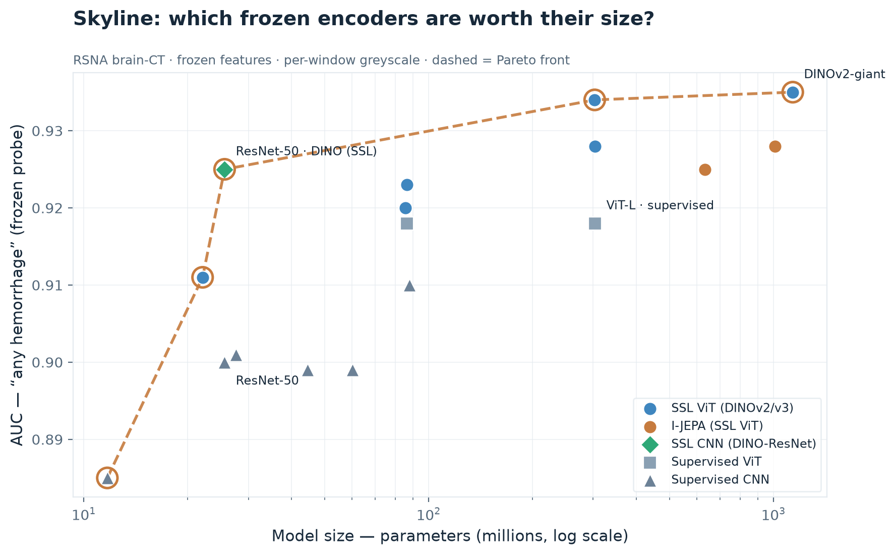
One caveat: this skyline is a snapshot at a fixed compute budget, not a statement about scale. We only train a small probe on frozen features, so a larger model's higher-dimensional notes overfit that probe more — the more so the less data you use. The very largest encoder (7B parameters) ran on only a small fraction of slices by budget choice. Read the big models' position as our budget, not their ceiling.
Different training styles see different things — so choosing a diverse few beats pooling everything.
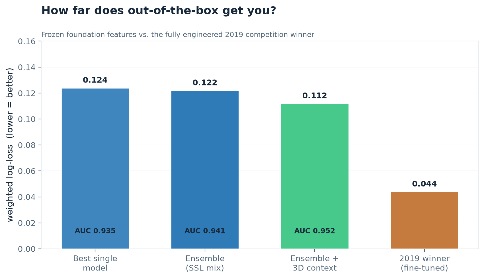
No single model wins alone, and none is redundant either: different models make genuinely different mistakes, so a small, curated ensemble captures signal none sees by itself: 0.935 (best single) → 0.941 (six models) → 0.952 (plus 3D context) → 0.955 (greedy selection over models, windows and context).
0.935 → 0.955 AUC — every gain chosen on validation, scored once on held-out testIn depth: the ensemble, select-don't-dump, and where the predictive model earns its keep
Pooling everything is the wrong instinct. The best ensemble is a curated, diverse handful of six — throwing in all ~20 models is slightly worse (0.934): the weaker supervised CNNs just dilute an equal-weight average. The same holds one level up: pooling all ~240 candidates (every model, both resolutions, every window, with and without neighbour context) lands at 0.946 — no better than the handful. What works is to choose the combination: a greedy selection, assembled on a validation split and scored once on an untouched test split, reaches 0.955 AUC (+0.009 over pooling, 95% CI clear of zero). It keeps 63 of ~240 candidates and rediscovers every lever in this article at once.
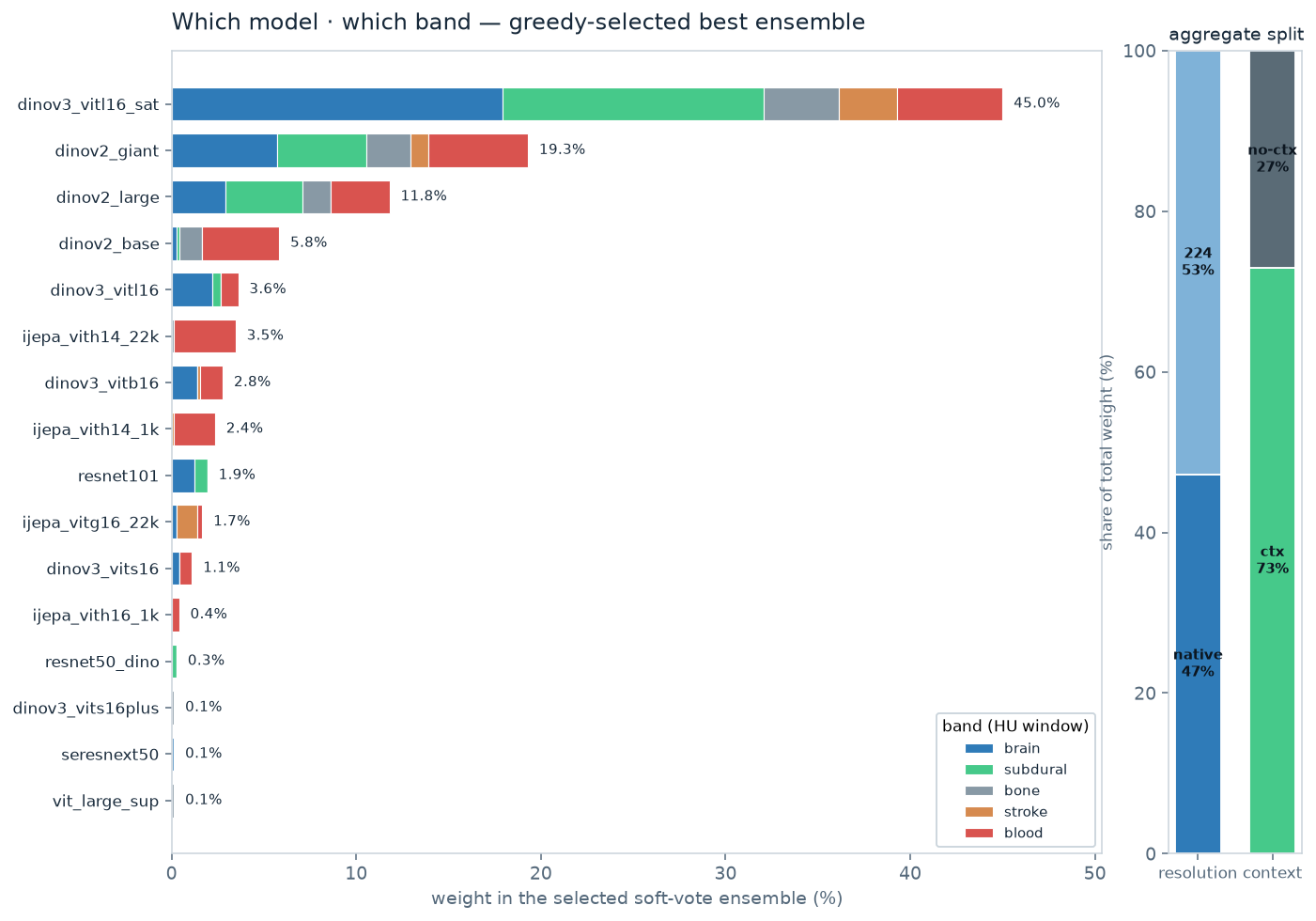
Two extra levers needed no retraining at all. Adding two narrow windows — one on the subtle gray-white band, one on the fresh-blood band — gives a small but statistically significant lift (+0.004 held-out). 3D context — letting each slice borrow the averaged notes of its neighbours, since a bleed usually spans several adjacent slices — adds clearly more (+0.012, also significant).
And something almost poetic falls out of the decomposition. Sort each model's weight by window, and the ensemble splits along the inductive-bias axis from the background. The supervised CNNs contribute only through the broad clinical windows (0% from the narrow ones). The bias-light I-JEPA is the mirror image: ~95% of its contribution flows through the narrow blood and stroke windows (79% from blood alone). DINO sits in between. In one line: the lighter a model's built-in assumptions, the more its unique value lives in the sharp, localized “is there a bright blob here?” view. Hold onto that — it's the first hint that “bias-light” buys you something specific, even if it doesn't win outright.
I-JEPA learns by predicting the hidden part of an image from its surroundings — “what belongs here, given the context?” — and trains with no colour or contrast tricks. So it ought to be unusually alert to a region that deviates from what its neighbourhood predicts, and it keeps raw contrast intact rather than learning it away. The narrow blood window is exactly that situation: everything clipped flat, except a bright blob of fresh blood standing out from a uniform field. DINO's gift — invariance to appearance, crop and colour — suits the broad, textured windows instead. If it holds, “less inductive bias” never meant “better” — it meant complementary. The obvious thing to test next.
Method note. Every gain here is chosen on validation and reported once on a held-out test, with patient-level bootstrap confidence intervals. These are out-of-sample gains, not numbers tuned on the test set — and naming that discipline is the point: it's what makes small, real differences trustworthy.
Around 50 labelled scans already beat chance — the rare-finding regime is viable.
The third lever is how little you need. In medicine the pressing question is often the opposite of big data: for a rare finding you may have only a handful of labelled cases. With frozen features, ~50 examples land at ~0.74 AUC, a few hundred reach ~0.84, and the curve flattens after a few tens of thousands.
50 labels → 0.74 · 500 → 0.84 · 1,000 → 0.86 · 133,000 → 0.935In depth: the few-shot curve and its caveat
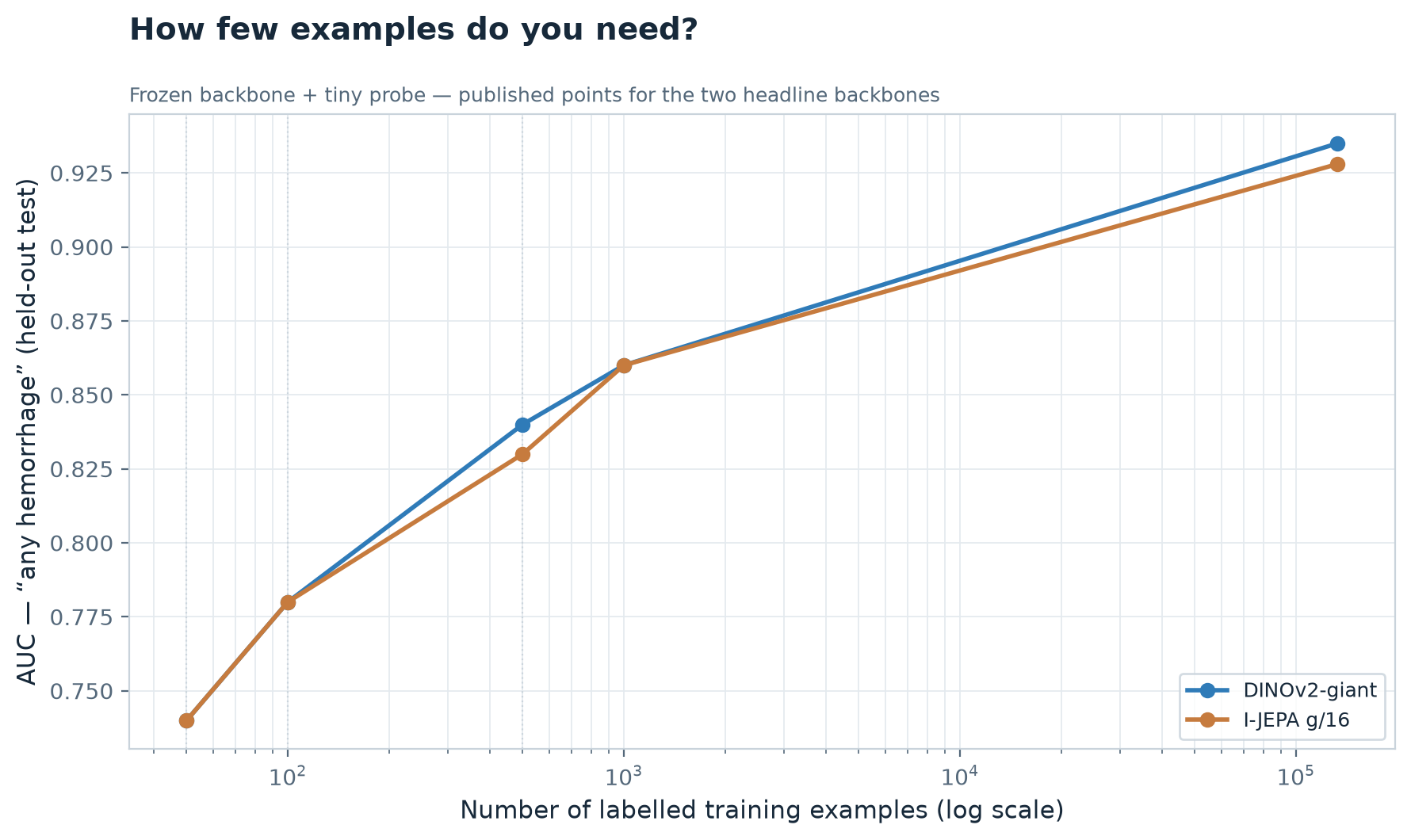
That's why our quarter-of-the-dataset barely differs from using everything — and why a brand-new condition with only a few hundred labels is not hopeless with frozen features.
How far this carries over depends on how conspicuous the finding is. A brain bleed is relatively visible; a subtle finding would need more examples. The move is always to test it on your own few samples — exactly as done here.
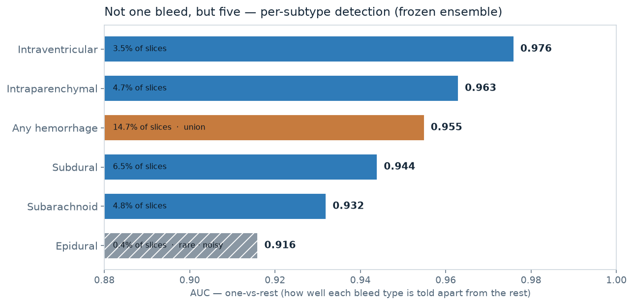
Not one bleed, but five — told apart at 0.92–0.98 AUC, and the type decides what happens next.
The same frozen notes carry more than 'bleed yes/no'. Each slice is labelled for five haemorrhage types, several can co-occur, so this is a multi-label problem: one tiny classifier per type. The ordering is clinically sensible — dense, well-localised bleeds are easiest; the thin, diffuse subarachnoid is the hardest common type.
Intraventricular 0.976 · intraparenchymal 0.963 · subdural 0.944 · subarachnoid 0.932 · epidural 0.916 (rare, noisy)In depth: per-type results, care pathways, and the distance to the 2019 winner
Why the type matters — not just that there's blood
The five types fork into different care pathways: a different doctor to call, a different scan to order next, a different room to prepare.
| Type | What it typically triggers |
|---|---|
| Epidural | arterial, can deteriorate fast → neurosurgical evacuation (theatre) |
| Acute subdural | mass effect → neurosurgical evacuation (theatre) |
| Subarachnoid | usually aneurysmal → CT-angiography, then coiling / clipping; often a transfer |
| Intraventricular | hydrocephalus risk → ventricular drain |
| Intraparenchymal | blood-pressure control, anticoagulation reversal, intensive care |
So the type, not just the presence of blood, decides what happens next — knowing it within seconds of the scan lets the right pathway start early rather than after the read.
The reality check: how far from the experts?
The 2019 competition was won with a heavily engineered system: three fine-tuned CNN architectures blended across cross-validation folds, two sequence models reading context across slices, plus test-time augmentation. Our quick, frozen approach lands at roughly 2.6× the winner's error — far from the top, achieved with a tiny fraction of the effort. That gap is in log-loss; on pure ranking (does it sort bleeds above non-bleeds?) our ensemble is already strong (~0.95 AUC). The shortfall is mostly capability (fine-tuning), not calibration: adjusting confidence after the fact moves the score by only ~0.001.
One expectation, though, did not survive contact with the data — the bet we set up in the background.
The bet — “less bias means better transfer” — did not hold: DINO stays ahead of I-JEPA.
Recall the natural expectation: because I-JEPA bakes in the least human assumption, it should adapt best to a domain it never saw. Reasonable, literature-backed — and not what happened. The top three frozen models are all DINO; I-JEPA sits just behind.
DINOv2-giant 0.935 · I-JEPA g/16 0.928 — the strong form of the hypothesis failsIn depth: the table, why the colour bias didn't bite, and the one clean win
We've just seen I-JEPA pull its weight inside the ensemble, especially in the narrow blood window. But the bet from the background was stronger than that: the least-assuming model should win outright. It didn't.
Because I-JEPA bakes in the least human assumption, it should adapt better to domains it was never trained on — such as medical imaging — than the more “pre-shaped” methods (DINO, or fully supervised models).
It's a reasonable bet, not hand-waving. Prior work points the same way: colour-jitter can actively damage learned features (Planckian Jitter, 2022); JEPA-style methods work without heavy augmentation (You Don't Need Data Augmentation in SSL, 2024); invariance vs. predictive methods suit different signals (Pretext Matters, 2026).
| Model | Family | AUC (any bleed, frozen) |
|---|---|---|
| DINOv2-giant | DINO (self-distill.) | 0.935 |
| DINOv3-L/16 (sat) | DINO | 0.934 |
| DINOv2-large | DINO | 0.928 |
| I-JEPA g/16 | I-JEPA (predictive) | 0.928 |
| I-JEPA H/16 | I-JEPA (predictive) | 0.925 |
The colour argument barely applies here. A CT is grayscale — there's no colour for DINO's colour-jitter augmentation to mislearn — so the worry that its “photo” assumptions would hurt on medical images largely doesn't bite. That's part of why the “less-bias-wins” bet didn't pay off: there was little colour bias to punish in the first place.
And yet I-JEPA isn't beaten so much as tied — it matches DINOv2 despite training on a far smaller image collection, and inside the ensemble it owns the narrow blood window. So “less bias” didn't mean “better”; it meant different, and complementary — most likely paying off in data efficiency rather than raw transfer.
One clean, controlled win for self-supervision
The bet on bias failed, but a simpler comparison held. When everything is held constant except the teaching style — same ResNet-50, same data, only supervised vs. self-supervised — self-supervision wins clearly: 0.900 vs. 0.925 AUC (+0.025). For the newer transformer models the difference was small and tangled up with other factors — indicative, not proof.
So where does all this pay off?
What it means: a clinic could build its own triage for the findings no vendor covers — from a handful of labels.
For the obvious, common findings this is a solved, deployed market — commercial tools triage haemorrhage and large-vessel occlusion well, and we don't claim to beat them. The interesting space is what they don't cover: rarer findings, local patient mixes, each department's own workflow — where frozen features plus a few hundred labels are enough to start, improvable step by step.
Start frozen (hours of work) → add labels → fine-tune → pre-train on your own scansIn depth: where it earns its keep, the economics, limits, and what's next
| If you are… | The takeaway |
|---|---|
| Curious (non-technical) | An AI trained only on everyday photos can already spot brain bleeds reasonably well — without ever “studying medicine.” That's the power of learning the gist. |
| In medical AI | Frozen foundation features are a strong, near-free baseline — enough to prototype workflow triage on your own data with a handful of labels, then improve in steps. Most valuable for the rare findings no off-the-shelf tool covers. |
| In tech (any domain) | What you pre-train on matters more than the exact recipe, and a diverse ensemble beats a single big model. “Less inductive bias = better transfer” was intuitive but didn't hold cleanly. |
Where a cheap detector actually earns its keep
Not at a fully-staffed stroke centre at midday. It earns its keep where expertise or geography is the bottleneck — and the hard numbers here are from deployed systems, not from us:
- The transfer decision — a small hospital with a scanner but no neurosurgery. The clock that matters is door-in-door-out time, routinely over two hours. In one hub-and-spoke network, automated detection cut it from 202 → 113 minutes and team notification from 45 → 7 minutes (Viz.ai, 2024).
- The weekend, when no expert is in the building. Clinically-important preliminary-vs-final discrepancies run ≈2–6% on-call, and the bleeds most often missed are the subtle ones — subdural (39%) and subarachnoid (33%) (AJNR). Those are the same two types our model finds hardest — but a model doesn't tire at 3 a.m. The value isn't “better than a neuroradiologist”; it's a consistent second read where none is on site.
Why a single clinic could build this itself
- It needs very few labels. The few-shot curve reached useful accuracy from tens to a few hundred labelled cases — not the tens of thousands a from-scratch model demands. A clinic's own archive, lightly annotated by its own staff, is enough to start.
- It improves in steps. Begin with a frozen model and a tiny probe — hours of work. If a finding matters more, add labels; if it matters a lot, fine-tune; at the ceiling, run label-free pre-training on the hospital's own unlabelled scans. Each step is optional and compounding.
The thread from the outsiders and the satellite test points one way: pre-train on the target domain itself. The defining property of these self-supervised methods is that they need no labels at all — so the same recipe could run on a hospital's large archive of unlabelled CT / MRI, letting the features speak “medical” natively, with only a handful of labels on top. We didn't test the pre-training itself; it would need its own study — and, for clinical use, proper validation and regulatory work. But it's how a data moat becomes a model moat.
Limits — this was a quick look, not the last word
- Frozen, not fine-tuned. Adapting the models to CT would extract substantially more — the more so the further the input sits from everyday photos.
- Light 3D context only. Keep-the-slice-plus-averaged-neighbours beat both full concatenation (overfits rare subtypes) and naive averaging (blurs the slice, hurt). A fully learned sequence model across slices — as the winner used — is the remaining path to more.
- Not a like-for-like leaderboard number. All scores are on our own patient-disjoint split, not the 2019 private test set. The “2.6×” is a sanity check on scale, not a head-to-head ranking.
The workflow figures above are from deployed, validated systems — not this work. We demonstrated the capability on public, imperfect data, with no clinical deployment and no clinical study. Turning it into a safe second-reader or transfer trigger is a separate, properly-regulated effort; no MDR/CE claim is made here.
If you're working on this: the building blocks are here today — putting them to use takes engineering, not a breakthrough. If you're improving clinical imaging workflows with AI, with the in-domain data and clinical reach to do it properly, I'd welcome the conversation.